American Salon Adaptive Prototype
Wireframe, HTML5, Adaptive Layouts
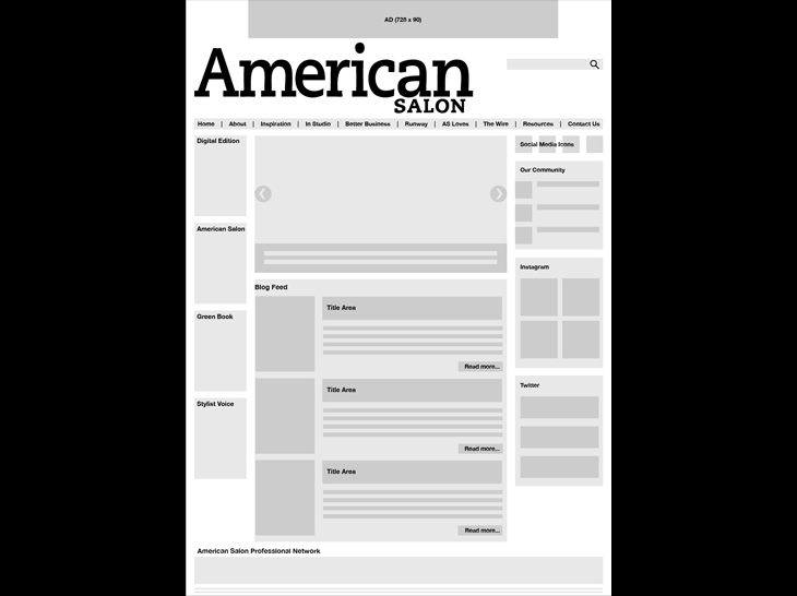
I'd developed the original wireframe for this concept, then built a functional prototype so the business team could see how their content would reflow. The adaptive concept was new to the business teams, so it was important they really see how their content would react in different environments.
The prototype is functional across desktop, tablets, and mobile phones. Scaling in the browser will work, but the menu breakpoints are setup for 767 and 959. We had five basic layouts, one with a minor addition.
Our development team has taken on the site build because of internal resource problems.
I have since began crafting the Drupal 7 templates in my own time that will override the Zen base theme files.